© 2025 bb&b communication et marketing industriel
Conception of the brand identity for the French industrial group Frénéhard & Michaux
3 April 2017
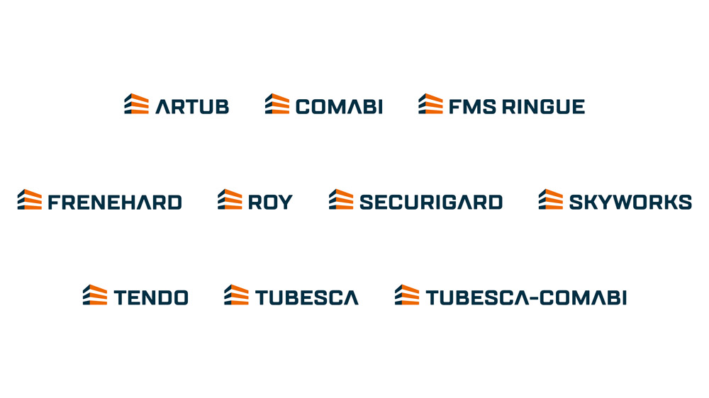
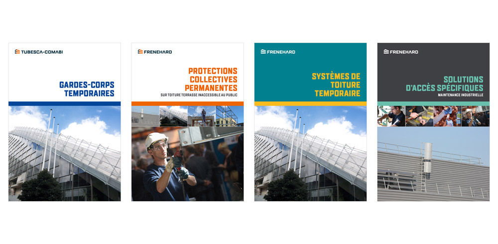
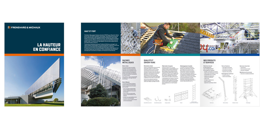
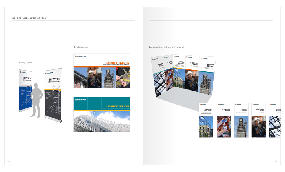
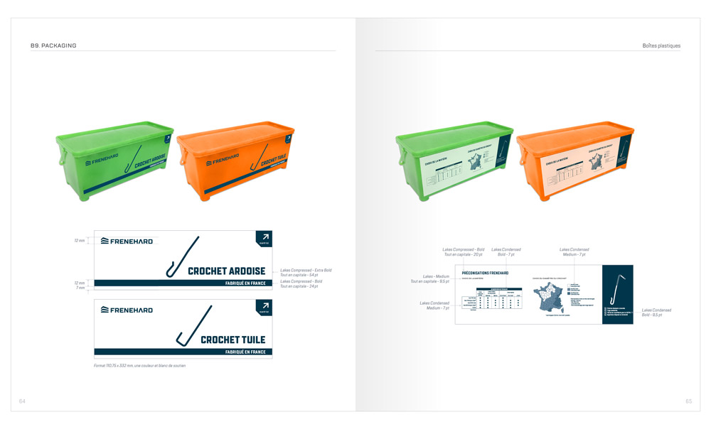
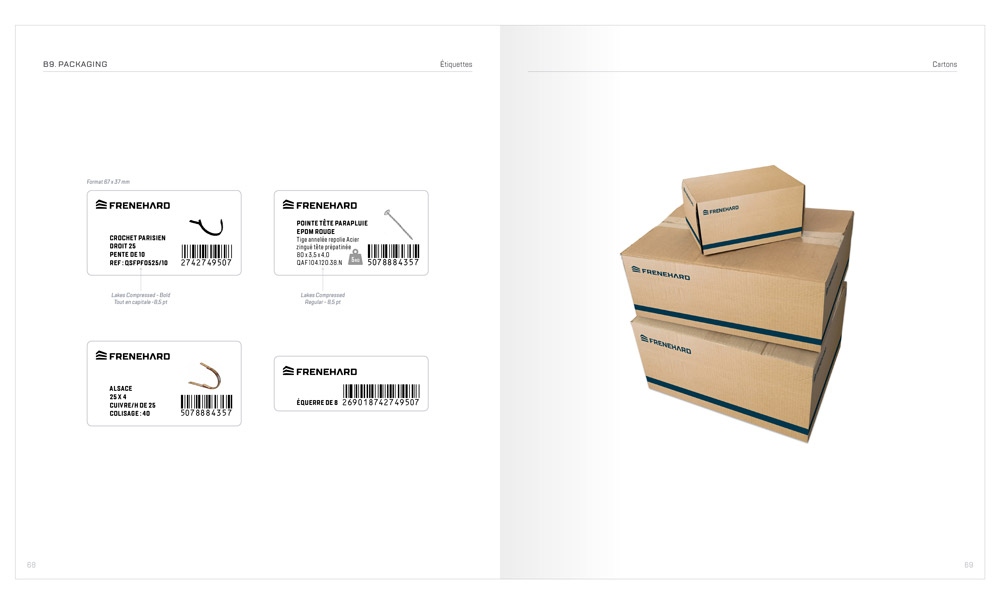
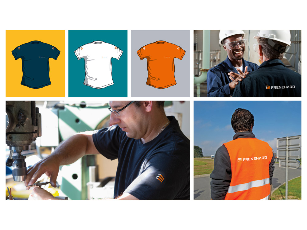
The group Frénéhard & Michaux combines brands such as Artub, Comabi, FMS Ringue, Frénéhard, Roy, Sécurigard, Skyworks, Tendo, Tubesca, each deeply rooted in their individual market. Created by the merger of Tubesca-Comabi and Frénéhard & Michaux in 2016, the new entity was looking for a federating brand identity. Guided by bb&b, the group has adopted a strategy at half way between a branded house and a house of brands. The newly established visual identity was designed to preserve each brand’s specificity and market position. At the same time, it creates a strong and recognizable common denominator which unifies and federates the brands under a single umbrella. Beginning of 2017, this strategy has been adopted by all brands of the group.
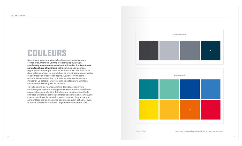
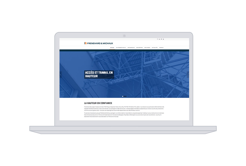
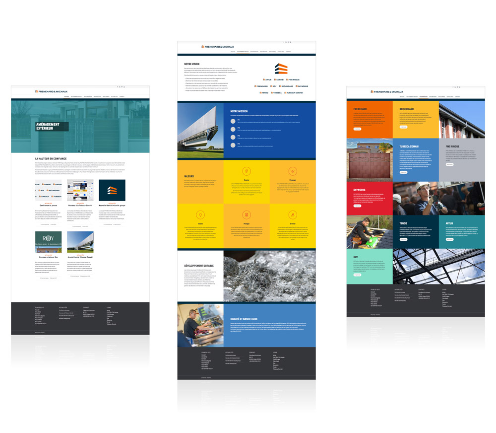
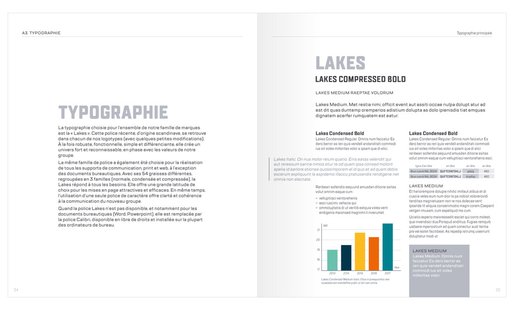
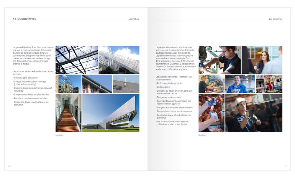
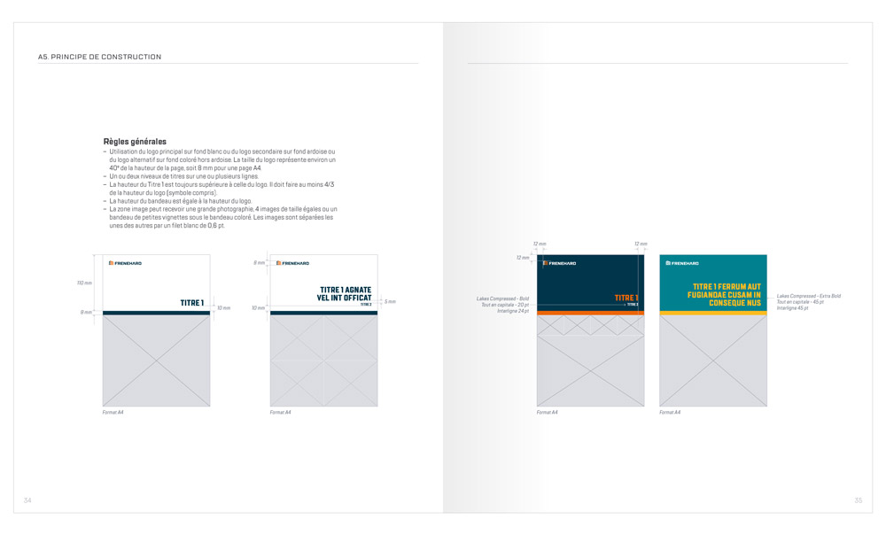
The visual identity conceived by bb&b is based on a recurrent symbol, directly inspired by the construction business and the notion of height, which represents the focal point shared by all the entities of the group. Building, arrows or chevrons – whilst potential interpretations are multiple, the direction is set: upwards. The work realized by bb&b includes brand strategy, conception of brand identity, design rules and the corporate web site.


© 2025 bb&b communication et marketing industriel